For the first time since 2019, the professional men and women race the IRONMAN World Championship on the same day in Kailua-Kona. It is also the final stop of the 2026 IRONMAN Pro Series, with 6,000 points on offer to each winner, so the race carries both a world title and a season title. The men start at 6:20 a.m. local time, and by the time the leaders reach the Energy Lab the conversation will, as always in Kona, be about heat, fuelling and who managed both best.
In this post I bring together three things: what the professional race data tell us, what the newest research says about carbohydrate intake during racing, and what we know about heat acclimatisation and the conditions expected on the Big Island.
The data: trends, conditions and predictions
To support this preview I built an interactive Long Distance Triathlons Dashboard, which brings together professional-only results from IRONMAN, IRONMAN 70.3 and T100 racing (sourced from PTO Stats) with race-day environmental data from Open-Meteo. A few design choices are worth explaining, because they matter for how the numbers should be read.
First, split-time trends use the average of each race’s top three finishers rather than the winner alone, with a ±1 SD band. A single winning time is a noisy signal; the top-three average, and the width of that band, tells you both how fast the front of the race was and how close the podium fight was. Second, conditions are matched to performance using WBGT (wet bulb globe temperature) rather than air temperature for the bike and run, since WBGT captures humidity and radiant load, which is exactly what makes a 30 °C day in Kona so different from a 30 °C day somewhere dry. Wind is averaged across the 07:00–16:00 window that covers professional race time, rather than taking a single daily gust. Third, the correlation plots use every individual finisher’s split against the conditions of that race, not race averages, so you can filter by brand and see how the relationship holds up.
The Rankings & Predictions page applies a simple form-based model to the start lists. It is deliberately a heuristic, not a crystal ball: it rewards consistency and recent results, and it cannot know who has been ill, who crashed in training, or who has nailed their heat preparation. It is, however, a useful benchmark against which to judge the race once it is run.
The historical benchmarks are formidable. Patrick Lange’s course record of 7:35:53 in 2024 was built on a 47:09 swim, 4:06:22 bike and 2:37:34 run, and the same race saw Sam Laidlow ride 3:57:22. Lange, now 40, has said this will be his last IRONMAN. In the women’s race, Solveig Løvseth won on her Kona debut in 2025 in 8:28:27, just 35 seconds ahead of Kat Matthews, who set a women’s run record of 2:47:23, with Laura Philipp third in 8:37:28. That race is remembered as much for Taylor Knibb, who was leading with around two miles to go before collapsing – a reminder that in Kona the margin between a world title and a medical tent is thin.
On the men’s side the defending champion Casper Stornes is out after a training crash, which opens the race up. Laidlow arrives unbeaten in four races in 2026, including Challenge Roth and an IRONMAN Lanzarote win by almost nine minutes. Kristian Blummenfelt leads the Pro Series standings, and Gustav Iden, Marten Van Riel (on his Kona debut), Magnus Ditlev and Lange complete a field with four former world champions. Independent modelling by Thorsten Radde at Trirating suggests the leading men share roughly three quarters of the win probability, against about 85% for the leading women – in other words, a surprise is more likely in the men’s race. That is consistent with what I see in the data: the women’s front-runners have more head-to-head history on this course and in these conditions.
Fuelling: how much carbohydrate is enough?
Few areas of endurance practice have moved as fast as in-race fuelling. The 2016 ACSM sports nutrition guidance recommends up to 90 g/h of carbohydrate from multiple transportable carbohydrates (glucose–fructose mixtures) for events longer than 2.5–3 hours. In the field, however, many professionals now report targets of 120 g/h and, in some cases, far higher. Two papers published this year help separate what is supported by evidence from what is enthusiasm.
Morton and colleagues’ review in the Journal of Nutrition (Morton et al., 2026) revisits more than a century of work on carbohydrate and endurance. Their conclusion is that the upper limit of recommended intake could reasonably move from 90 to 120 g/h for trained athletes, since both exogenous and whole-body carbohydrate oxidation can increase at these intakes, with possible benefits for durability and economy. They are explicit, though, that doses of 120–200 g/h seen in the field are not yet substantiated by research, and they propose a more individualised model that accounts for carbohydrate blend and ratio, format, gut training and environmental conditions.
A new study in Medicine & Science in Sports & Exercise (Martyn et al., 2026) tested this directly. Eight trained men cycled for three hours followed by a capacity test, ingesting 10, 90, 120 or 150 g/h (maltodextrin–fructose at 1:0.8, with stable-isotope tracers). Exogenous oxidation rose with dose (1.23, 1.48 and 1.62 g/min at 90, 120 and 150 g/h), but whole-body carbohydrate oxidation was identical at 120 and 150 g/h (2.6 g/min). Exercise capacity was clearly impaired at 10 g/h but did not differ among the higher intakes, and the modelled optimal dose was about 107 g/h (95% CI 92–122 g/h). Just as important, the between-athlete spread in exogenous oxidation was large and grew with dose.
For a Kona athlete the message is practical. Somewhere around 90–120 g/h is where the evidence currently sits; going beyond that is unlikely to add whole-body carbohydrate use and increases the volume of fluid and sugar the gut has to handle. In the heat this matters even more, because splanchnic blood flow is reduced and gastrointestinal distress becomes a major cause of underperformance. Recent work from Monash (Hillemacher et al., 2026) shows that symptom reports alone probably underestimate gut disturbance during exertional heat stress, and a survey at the 2025 Western States 100 (Mougin et al., 2026) found that every finisher under 18 hours had a structured carbohydrate plan, compared with 69% of the slowest finishers, with gastrointestinal symptoms reported by 63% of finishers. The athletes who fuel best on Saturday will be those who rehearsed their exact race-day intake, in the heat, many times beforehand.
Heat: acclimatisation and the Kona forecast
October in Kona typically means highs of 30–32 °C and humidity around 80%, with the lava fields and asphalt of the Queen K adding considerable radiant heat. The ocean is around 25–27 °C, so the swim is non-wetsuit. The National Weather Service forecast issued on Friday afternoon for Saturday calls for sunny conditions with isolated showers in the morning, becoming partly sunny with scattered showers in the afternoon, highs of 84–89 °F (29–32 °C) near the shore, and light winds becoming westerly up to 10 mph in the afternoon, with a 40% chance of rain. Light winds are good news for bike times but bad news for heat dissipation: less convective cooling on the bike and in the Energy Lab means a higher effective heat load, and afternoon cloud and showers could become the most important variable for those still running. On the dashboard you can see how WBGT and wind have related to bike and run splits across previous editions.
The physiology of heat acclimation is well established, but recent studies have refined the practical questions of dose, method and side benefits. A randomised trial in endurance-trained athletes (Snape et al., 2026) showed that just five days of isothermic acclimation in hot, humid conditions (32 °C, 70% RH) lowered resting heart rate by 8 bpm, expanded plasma volume by about 7% and increased sweat loss by around 500 mL during a heat stress test – the classic adaptations that protect cardiac output and thermoregulation on a long day. Renal stress markers were not altered, which is a useful reminder that acclimation improves tolerance but does not remove the physiological cost of exercise in the heat.
Method matters. In well-trained cyclists, six days of post-exercise hot water immersion reduced perceptual strain but did not improve time-trial performance in warm or hot conditions (Kjertakov et al., 2025), suggesting passive approaches are not a substitute for active exercise-heat exposure in already fit athletes. Interestingly, training in the cold while wearing layered clothing reduced perceived exertion and thermal sensation in subsequent heat exposure (Yamaguchi et al., 2026), although without measurable changes in sweat rate or core temperature.
Heat training is also increasingly used for its haematological effects, something the Norwegian group in this field has made very visible. In cross-country skiers and biathletes, adding three weekly heat-suit sessions to a moderate-altitude camp increased haemoglobin mass by 2.9%, compared with 1.2% with altitude alone (Rønnestad et al., 2026), and in elite cyclists five weeks of heat training produced haemoglobin mass gains comparable to a live-high train-high camp (Cubel et al., 2025). In neither study did this translate into clear performance gains, which is an honest caveat: the adaptations are real, but how much they matter on race day is still debated.
The key point, from both the literature and my own experience working in Doha, is that heat acclimatisation is not a single intervention but a process that interacts with everything else: hydration, sodium, cooling strategies, pacing and, crucially, fuelling. Heat increases carbohydrate dependence while simultaneously reducing the gut’s ability to deliver it. The athletes who arrived in Kona early, trained in the conditions and rehearsed their nutrition in that environment will have a real advantage, whatever their power numbers say.
What to watch
If the winds stay light, expect fast bike splits and a large group reaching T2 together, which shifts the race to the marathon and to whoever has managed heat and fuelling best through the first six hours. If the afternoon clouds and showers arrive, they may favour the chasers. And if history is any guide, the athlete leading with 10 km to go usually wins – unless, as Knibb discovered last year, the heat decides otherwise.
Explore the full data, filter by brand and race, and check the predictions at ironmandt100analysis.netlify.app. I will revisit the predictions once the results are in.
References
Cubel C, et al. Haematological adaptations to high-altitude and heat acclimation training in elite male cyclists. Exp Physiol. 2025. doi:10.1113/EP092968 Hillemacher K, et al. The relationship between biomarkers of exercise-induced gastrointestinal syndrome and exercise-associated gastrointestinal symptoms. Sports. 2026. doi:10.3390/sports14060248 Kjertakov M, et al. Limited benefit of repeated post-exercise hot water immersion on exercise performance of well-trained cyclists in warm and hot conditions. Eur J Appl Physiol. 2025. doi:10.1007/s00421-025-06041-4 Martyn HJ, et al. Effects of 10, 90, 120 and 150 g/h CHO on substrate metabolism, exogenous oxidation and exercise capacity: implications for CHO personalization. Med Sci Sports Exerc. 2026. doi:10.1249/MSS.0000000000004176 Morton JP, et al. From metabolism to medals: contemporary perspectives and revisiting carbohydrate guidelines for fueling endurance athletes during exercise. J Nutr. 2026;156(5):101442. doi:10.1016/j.tjnut.2026.101442 Mougin L, et al. Heat preparation and nutrition strategies for a 100-mile ultramarathon in extreme heat: a questionnaire study at the Western States Endurance Run. J Sci Med Sport. 2026. doi:10.1016/j.jsams.2026.05.014 Rønnestad BR, et al. Heat training augments hemoglobin mass during a moderate-altitude training camp in well-trained endurance athletes. J Appl Physiol. 2026;140(5):1298-1310. doi:10.1152/japplphysiol.00777.2025 Snape D, et al. Five days of heat acclimation improves cardiovascular and thermoregulatory responses without altering renal stress biomarkers in endurance athletes. PLoS One. 2026;21(8):e0345346. doi:10.1371/journal.pone.0345346 Yamaguchi K, et al. Short-term endurance training in the cold with layered clothing mitigates perceptual strain during exercise in the heat. Eur J Appl Physiol. 2026;126(10):5543-5552. doi:10.1007/s00421-026-06319-1
Race and forecast information from USA Triathlon, Triathlete, 220 Triathlon, Big Island Now and the US National Weather Service. Literature retrieved via PubMed.
The 2026/27 season is a few matchdays old, which is exactly the point in the calendar when injury counts start climbing. It seemed a good moment to go back to the European football injury dashboard I put together earlier in the year and deal with something that had been bothering me about it.
The original version had a structural weakness. Its month-by-month figures were not measurements. The Howden Group Men’s European Football Injury Index — the best free source covering the top five leagues — publishes one total per season, not one per month. To draw a monthly curve I had been distributing those annual totals across the year using the seasonal distribution reported in the UEFA Elite Club Injury Study. That gives a defensible shape, but every individual month was an artefact of the model rather than a count of anything. If you had asked the chart whether September 2023 was worse than September 2024, the answer would have been decided by the annual total, not by what happened in September.
So I added a second dataset alongside it, and let the reader choose which one they are looking at.
Two datasets, two different questions
The dashboard is here: footballinjuries.tiiny.site. A toggle at the top switches between the two sources. They answer genuinely different questions, and I have tried to make the distinction obvious rather than burying it in a footnote.
Season pattern — estimated monthly counts across seven leagues and five seasons, showing when in the year injuries cluster. Good for shape, approximate for magnitude.
Injured right now — a real count of every player listed as injured on a given date, from Transfermarkt. Good for who is actually missing, useless as a season total.
The seasonal view. The September peak is the most consistent feature in the whole dataset — players return from the summer break, fixtures arrive quickly, and bodies that have not been at match intensity for weeks are asked to perform. A second, smaller rise comes in April as accumulated load tells.
The Transfermarkt layer
The new view collects every player listed as injured on Transfermarkt‘s injury pages for the Premier League, Bundesliga, La Liga, Serie A, Ligue 1, Eredivisie and Liga Portugal. On 28 August 2026 that came to 257 players. These are individual records — a named player, his club, and what is reported to be wrong with him — not a figure derived from anything.
Players injured across the seven leagues on 28 August 2026. You can click into any league to see it club by club.
The Bundesliga stands out with 66 players out, against 15 in Ligue 1 — though before reading anything into that, note that squad sizes, fixture load and how much press attention a league receives all feed into these numbers. That last factor matters more than it might appear, and it leads directly to the caveats.
Where this data is weak, and why I have said so on the page
Transfermarkt injury records are compiled from press reports, not club medical records, and that has consequences worth stating plainly.
A snapshot over-represents severe injuries. A cruciate ligament rupture stays visible on the page for months; a grade one hamstring strain disappears within a fortnight. The injury mix in the chart is therefore more severe than the mix of injuries a league actually sustains. This is straightforward survivorship bias and it cannot be corrected without incidence data.
Roughly a third of records name only a body part. “Knee injury”, “ankle problems”, or simply “unknown injury”. I could have forced these into a category and produced a tidier chart, but that would be inventing precision that is not in the source. They appear as Not specified instead. In the Eredivisie this accounts for 32 of 56 records — a striking difference in reporting practice rather than in injury patterns, and one that is itself interesting.
These are counts, not rates. There is no exposure denominator — no adjustment for minutes played — so none of this is comparable with the injuries-per-1000-hours figures the epidemiological literature reports. For that you need the UEFA Elite Club Injury Study or club data, and this dashboard is not a substitute for either.
The Eredivisie and Liga Portugal are also absent from the Howden report entirely, so their seasonal estimates lean on published injury-rate research for comparable leagues and should be treated as softer than the other five.
Other changes
Two smaller things. The dashboard is now written for a general reader rather than for me — plain-language injury categories, an explainer at the top, and a summary underneath the chart that rewrites itself as you change the selection. It also now states honestly how solid each season is: 2022/23 to 2024/25 are confirmed by Howden, 2025/26 has finished but is awaiting the December 2026 report, and 2026/27 has barely started and is labelled as a projection rather than a record.
The other change is invisible but was the reason several people saw a blank page: the chart previously loaded its plotting library from a CDN, and if that request failed — restricted network, content blocker, poor connection — the result was an empty rectangle with no explanation. It now draws its own SVG with no external dependencies at all. Nothing is loaded from anywhere. It works offline.
What next
The obvious next step is real month-by-month history rather than estimates. Transfermarkt does hold this — every individual injury record carries a start date — but assembling it means collecting player-level histories across seven leagues and several seasons, which is an overnight job rather than a page fetch. I have the pipeline written using the worldfootballR package; it is a matter of running it and validating what comes back. If it holds up, the estimated monthly figures get replaced with counted ones and the weakness I described at the top of this post disappears.
As with the triathlon dashboard, this is a living project and I would rather it be scrutinised than taken on trust. Have a look at the dashboard and tell me what is wrong with it, or what you would want to see next.
Seasonal estimates derived from the Howden Group Men’s European Football Injury Index (2024/25 edition, published December 2025) and the UEFA Elite Club Injury Study. Current-injury figures collected from Transfermarkt on 28 August 2026 and filtered to clubs competing in each league. Injury classification from free-text labels is approximate. These are counts without an exposure denominator and should not be read as incidence rates.
Lactate supplements are the latest hype. Lactate gels appeared in the Tour de France peloton, “exogenous lactate” is a growth category in sports nutrition, and the underlying science genuinely has moved — lactate is a fuel and a signalling molecule, not a waste product (if you want to read an excellent review from Prof George Brooks, the world leading authority on lactate metabolism, click here). The question I wanted answered was narrower and more practical: does ingesting it make anyone faster?
So I ran a systematic review and meta-analysis. I did not do it with the final aim to submit it to a peer reviewed journal to get a publication out of it. If I did that, you would be probably reading this in two years after going through the pain of: writing the paper, formatting it to a journal, submitting it, going around the houses with reviewers and editors, eventually get it accepted and published. I just wanted a quick answer for me and I am sharing this on my blog. So, despite the scientific approach to the process (systematic review and meta-analysis) this is not peer reviewed and therefore you need to consider this blog for what it is. For this work I used Claude Science (Anthropic) with Opus 5 as the LLM.
What follows is both the answer and an honest account of how it was produced — including where an AI research agent hit its limits, where it made mistakes, and where my judgement as the researcher had to override it. That second part matters as much as the first, because the tooling is now good enough that the interesting question is no longer “can it do the analysis” but “where does the human have to stay in the loop.”
The short summary
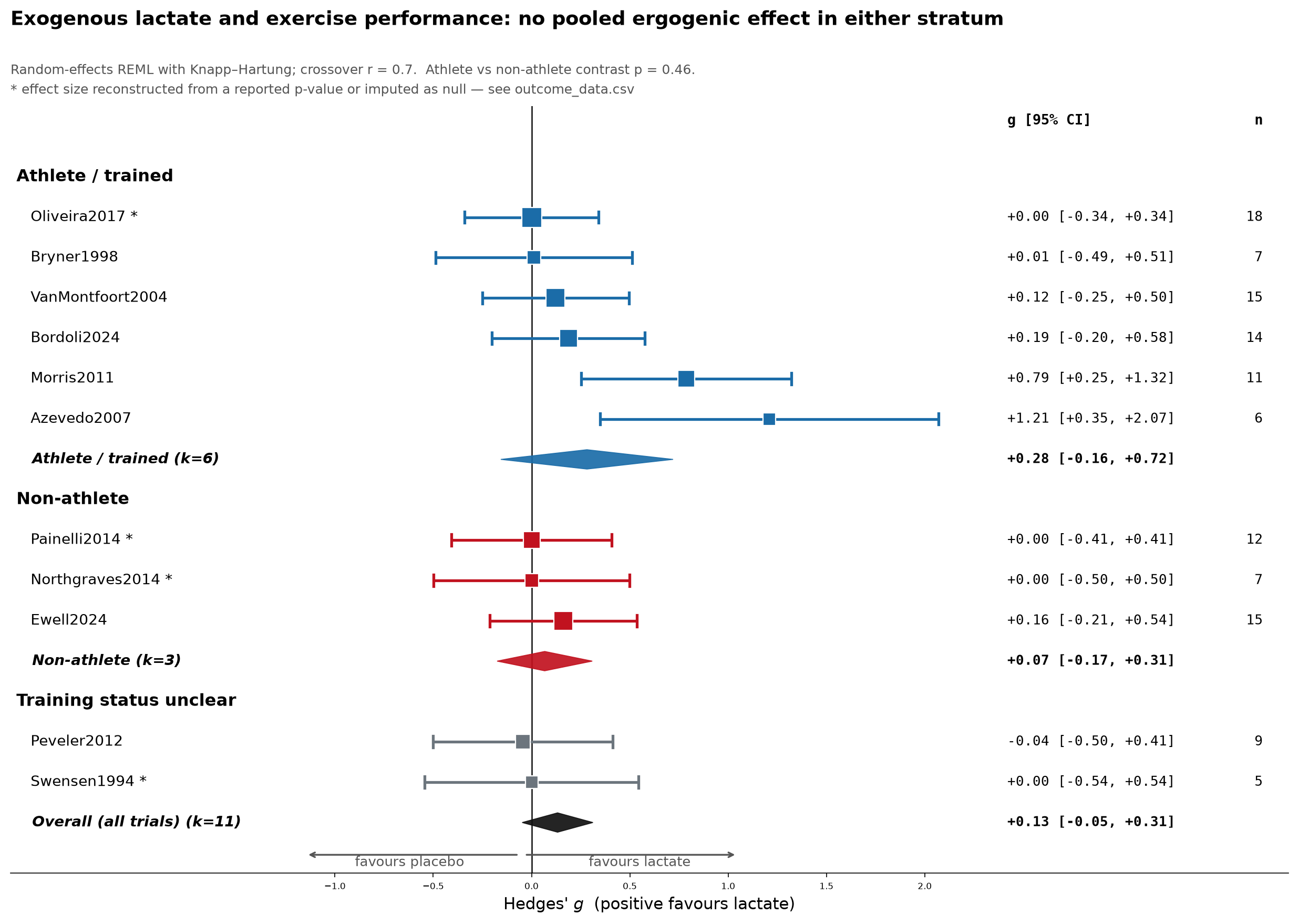
Across eleven randomised crossover trials (119 participants, 1994–2024), the pooled effect of exogenous lactate on exercise performance was g = 0.13 (95% CI −0.05 to 0.31, p = 0.13). That interval includes zero. Splitting by training status gave athletes g = 0.28 and non-athletes g = 0.07, but the formal test of that difference was null (p = 0.46).
Lactate is unambiguously a usable fuel and a genuine signalling molecule. It is not, on current evidence, an ergogenic aid.
Those two statements sit together comfortably. The marketing story runs: lactate is fuel, therefore ingesting lactate helps performance. The evidence supports the first half and has not yet delivered the second, but considering the paucity of studies, hopefully more studies will be conducted to see if this really works.
How the review was built
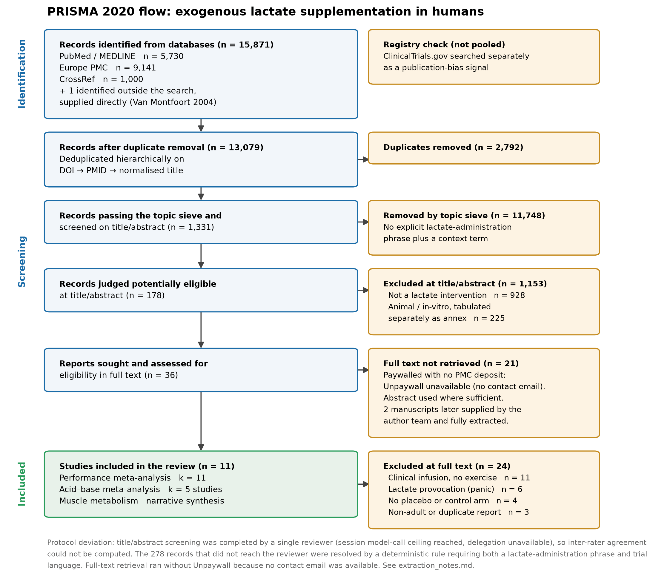
I searched PubMed/MEDLINE, Europe PMC and CrossRef, retrieving 15,871 records that deduplicated to 13,079. A topic sieve narrowed this to 1,331 records for title/abstract screening, 36 full texts were sought, and 11 trials met criteria. Ten came out of the search; the eleventh — Van Montfoort et al. (2004) — the search missed entirely, and it only entered the review because I went looking for it by hand afterwards. More on that below.
PRISMA flow. The two manuscripts obtained after the initial search are counted in the full-text row.
Where I had to intervene: the screening ceiling
The protocol specified duplicate independent screening with a Cohen’s κ agreement statistic — standard practice, and what any reviewer would expect. Partway through, the agent hit a hard capacity limit: it had screened 1,053 of 1,331 abstracts and could not run the second reviewer pass. Crucially, it stopped and asked rather than quietly proceeding, laying out three options: enable parallel processing so the full protocol could run, accept single-reviewer screening as a stated deviation, or narrow scope to the core identified trial set.
I chose to narrow scope. That was a judgement call with a real cost, and it is worth being explicit about the trade: the review is honest about the trials it found, but the 278-record tail got a keyword rule rather than reviewer judgement, and this review has no inter-rater agreement statistic. Every included trial was independently identified by more than one search route, which is reassuring about the core set — but it is not a substitute for duplicate screening, and I would not want that glossed. As it turned out, the search had a bigger problem than the screening did.
This is the first place the human-in-the-loop mattered. An agent optimising for a finished-looking deliverable would have reported “systematic review” and moved on. The useful behaviour was surfacing the constraint as a decision for me to own.
Where I had to intervene again: the search missed a trial
After the first version of this post went up I obtained two full manuscripts I had not been able to get during the review. One was Morris et al. (2011), which I had previously worked from the abstract. The other turned out not to be in the review at all: Van Montfoort et al. (2004), a 15-runner double-blind crossover comparing sodium lactate, sodium bicarbonate, sodium citrate and sodium chloride on time to exhaustion. It is indexed in PubMed. It is exactly on topic. The search did not surface it.
That is worth being blunt about, because it is a different kind of failure from the screening ceiling. The screening problem was a known limitation I flagged and worked around. This was a silent miss: a query built around lactate-supplementation phrasing did not match a paper framed as a comparison of four alkalinising salts, and nothing in the pipeline registered that anything was absent. Recall failures do not announce themselves — there is no error message for a paper you never saw. With one confirmed miss out of eleven included trials, the honest position is that I do not know the true recall of this search, and neither does any automated pipeline that has not been checked against a hand-built reference set.
Adding it did not change the conclusion — the pooled performance estimate moved from 0.13 to 0.13, which is the least interesting possible outcome and also the most reassuring one. What it did change is the acid–base picture, the small-study asymmetry test, and my confidence in the corpus being complete.
What the trials show
Performance outcomes, stratified by training status. Diamonds are pooled estimates; the flag marks effects imputed rather than reported.
The athlete stratum’s point estimate is four times the non-athlete one, which is exactly the sort of contrast that becomes “works better in trained athletes” in a product brochure. It should not. The interval spans zero generously, the moderator test is null, and the stratum is carried by its two strongest single results — both of which have a problem:
Azevedo et al. (2007) (g = 1.21, n = 6) — the largest effect in the review. It compared a lactate-polymer multi-ingredient drink against an isocaloric fructose/glucose sports drink. Active comparator, multiple active ingredients: any difference cannot be attributed to lactate only really.
Morris et al. (2011) (g = 0.79, n = 11) — this one changed since the first version of this post, and it is worth explaining how. Originally I could not obtain the full text, so I reconstructed the effect from the reported p-value and rated the trial high risk of bias for everything it did not describe. The full manuscript then turned up. It is a properly conducted double-blind randomised crossover with an aspartame placebo in matched capsules and at least 48 h between trials, so most of that bias rating was my ignorance rather than the trial’s design, and I have downgraded it to some concerns. But the means it contains (168 ± 31 vs 137 ± 41 s) give a larger effect than my reconstruction did, and the acknowledgements name the supplier: Sport Specifics Inc., the company behind SportLegs — the same firm that supplied and funded Ewell et al. (2024). The strongest signal in the trained stratum is a manufacturer-supplied product.
Drop Azevedo and the pooled estimate falls to 0.11. Drop Morris and it falls to 0.09 — Morris is now the single most influential trial in the analysis, which is an uncomfortable place for a sponsor-supplied product to sit. The athlete stratum’s I² of 59% is itself the tell that these trials are not measuring one common effect.
The caveat that matters most
Four of the eleven performance effects are null-imputed. Those trials reported their performance outcome as “non-significant” and gave no means or standard deviations, so there was nothing to extract. Entering them as zero is conservative about direction but it fakes precision — a non-significant result is compatible with a range of effects, not specifically with zero.
This is why the primary model shows I² ≈ 0% and a reassuringly tight interval. Refit on the seven effects that were actually reported, and the interval widens roughly twofold: g = 0.24 (95% CI −0.09 to 0.57). That is the honest number. I put it in the report next to the primary estimate rather than in a supplementary appendix, because reading only the primary model would leave you more confident than the evidence warrants.
Left: acid–base outcomes, shown with and without the newly added Van Montfoort trial. Right: the full sensitivity suite — every specification lands in the same place.
The mechanistic crux: no mediator big enough
If lactate salts worked the way bicarbonate does, the acid–base shift would be the mechanism. Pooled across five trials, that effect is g = 0.72 (95% CI −0.53 to 1.98) — but that number is doing something misleading, and the newly added trial is why. Van Montfoort et al. gave 400 mg/kg of sodium lactate, the largest dose in the corpus, and measured a very large bicarbonate shift (g = 3.36). Its placebo, though, was iso-osmolar sodium chloride, which lowers bicarbonate on its own — so part of that gap is the placebo moving down rather than lactate moving up, and the SD behind it is model-derived from a seven-person blood subsample. Excluding it, the pooled acid–base effect is g = 0.43 (95% CI −0.20 to 1.06). Both are on the figure. Neither interval excludes zero.
The most informative trial here is Oliveira et al. (2017), the only one that included a bicarbonate positive control. Calcium lactate moved bicarbonate essentially not at all (g = −0.04), in the same participants, against a comparator known to work. A dose that fails to shift blood chemistry also fails to shift performance. There is no mediator here large enough to produce an ergogenic effect.
Where lactate genuinely does something
The metabolic literature is much stronger than the performance literature, and it deserves separating out.
It is oxidised fast. In a tracer study, ¹³CO₂ production from orally ingested ¹³C-lactate rose faster and more completely than from any other labelled substrate tested, doubling between 45 and 60 minutes of exercise while every other substrate peaked at or after 75 minutes. The breath kinetics are too fast for a liver-first gluconeogenic route, which points at working muscle as the site of most of that oxidation.
It is antilipolytic, and substantially so. A sodium-lactate infusion raising plasma lactate to 2.7 mmol/L cut postabsorptive lipolysis by about 30% — palmitate flux 84 ± 32 versus 120 ± 35 µmol/min, mean difference −36 (95% CI −58 to −14), p = 0.003 — with lower free fatty acid concentrations. Insulin sensitivity itself was unchanged. This is a clean, well-controlled effect, plausibly via the GPR81 receptor in adipose tissue.
Note the direction, though. Suppressing fat oxidation during prolonged exercise shifts reliance toward finite carbohydrate stores. For endurance work that is arguably the wrong way round — which makes a substrate-utilisation trial more interesting than yet another time trial, and raises the real possibility that exogenous lactate impairs long-duration performance (but we definitively need experimental trials to test this hypothesis).
Quality of the evidence
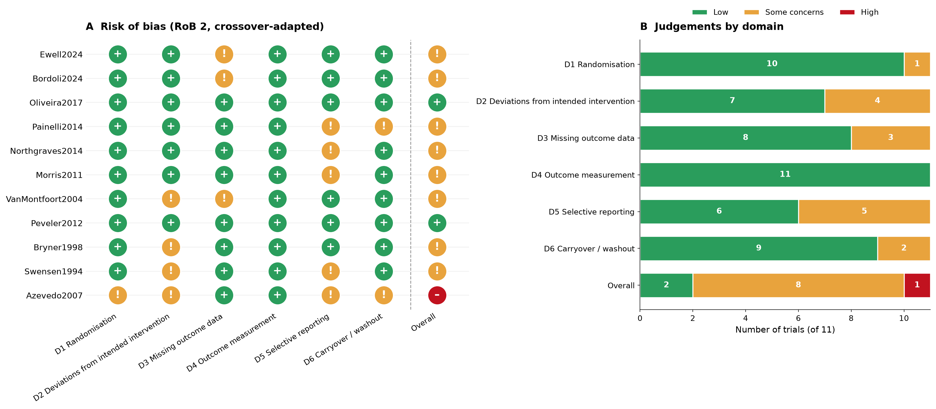
RoB 2 adapted for crossover designs: 2 low, 8 some concerns, 1 high.
Nine of eleven trials carry some concerns or high risk of bias. Selective reporting is the weakest domain — which is the same defect that produced the four null-imputed effects, since a trial reporting “no significant difference” without numbers is simultaneously a reporting problem and a data-extraction problem. Median sample size across the whole corpus is 11. Egger’s test now crosses the conventional threshold for small-study asymmetry (p = 0.049, previously 0.074) — at k = 11 I would still read that as descriptive rather than as a bias test, but it moved in the direction you would expect when a genuinely missed trial is added.
On GRADE domains I would call the performance evidence low certainty: downgraded for risk of bias, imprecision, and indirectness across heterogeneous forms, doses and comparators.
The chemistry: read the label
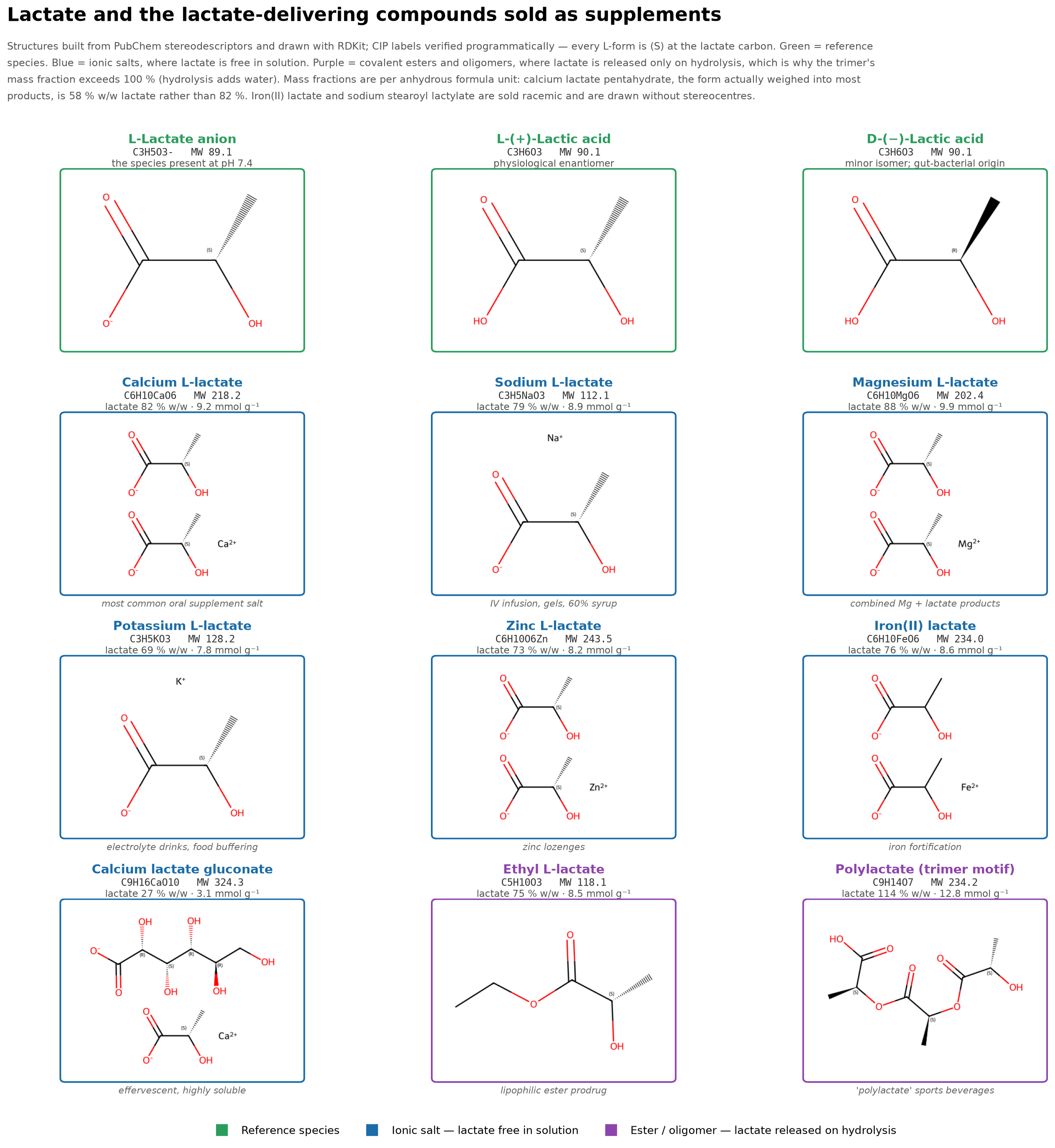
The last piece of work conducted with the AI agent was structural — what is actually in these products. I had the agent build every structure from PubChem stereodescriptors and verify each stereocentre computationally.
Lactate and twelve lactate-delivering compounds, grouped by release mechanism. Green: reference species. Blue: ionic salts, lactate free on dissolution. Purple: esters and oligomers, lactate released only on hydrolysis.
Where the agent got it wrong
This figure is where the most instructive error happened, and I want to describe it precisely because it is the kind of mistake that is easy to ship.
The first rendered version labelled every L-form with the CIP descriptor belonging to its mirror image. Physiological lactate is L-(S); the panels said (R). The cause was subtle: the SMILES strings had been written by hand, and reordering the substituents around a stereocentre while keeping the original chirality tag silently inverts the molecule. No error, no warning — a chemically valid structure of the wrong enantiomer.
It was caught by looking at the rendered figure and noticing the annotations contradicted the compound names. Every SMILES was then rebuilt from PubChem’s own stereodescriptors and re-verified on three axes: successful parsing, per-centre CIP label matching the name, and unchanged molecular formula. That third check is what confirmed the fix touched stereochemistry only, so the mass fractions computed earlier remained valid.
An agent that renders a figure and moves on ships the wrong enantiomer. Checking the output against what it claims to show is not optional.
There is a related point about why the error mattered scientifically rather than just cosmetically: several marketed lactate salts are sold as racemates. Iron(II) lactate and sodium stearoyl lactylate, among others, are DL- mixtures — meaning half the delivered lactate is the D-isomer, which in humans is largely of gut-bacterial origin and metabolised far more slowly. In the corrected figure those compounds are deliberately drawn without stereocentres, so the graphic does not imply an enantiomeric purity the products do not have.
Hydration state changes the dose by a quarter
Form
Lactate % w/w
mmol lactate/g
Magnesium L-lactate
88.0
9.9
Calcium L-lactate (anhydrous)
81.6
9.2
Sodium L-lactate
79.5
8.9
Iron(II) lactate (racemic)
76.1
8.6
Ethyl L-lactate
75.4
8.5
Potassium L-lactate
69.5
7.8
Calcium L-lactate pentahydrate
57.8
6.5
Sodium stearoyl lactylate (racemic)
39.5
4.4
Calcium lactate gluconate
27.5
3.1
Lactate content per gram varies more than threefold across marketed forms. Full table of 15 forms in the supplementary data.
Calcium lactate pentahydrate is the form actually weighed into most oral products, and it is 57.8% lactate by mass — not the 81.6% of the anhydrous salt. A trial reporting “500 mg/kg calcium lactate” therefore delivers materially different lactate depending on which it used, and papers frequently do not say. The counter-ion sets its own ceiling: calcium lactate at 500 mg/kg/day also delivers roughly 92 mg/kg/day of calcium.
Across the corpus of literature analysed, gastrointestinal tolerability — not lactate pharmacology — was the binding constraint. In Swensen et al. (1994), GI efflux at polylactate concentrations of 2.5% or above forced the drink down to 0.75%, meaning the tolerable dose may sit below any effective one: a dose-ceiling confound rather than simply low power. In Bordoli et al. (2024), overt GI side effects in the lactate arm likely compromised blinding.
What I take from this
For athletes and coaches. There is no good evidence lactate supplements improve performance, trained or untrained. The trials that look most favourable are the ones with an active comparator, compromised blinding, or a manufacturer in the acknowledgements. The single result I would build a follow-up study on is Ewell et al. (2024): oral lactate changed nothing about VO₂peak, ventilatory threshold or work rate at lactate threshold, but sustained work rate in a 20-minute functional threshold test was about 3.5% higher (204 vs 197 W). One modest effect on one outcome in fifteen people is a hypothesis, not a finding — and it is worth knowing that the supplement and the funding both came from the manufacturer. It points somewhere specific, which is different from being persuasive.
For researchers. The gaps are unusually well-defined. No trial has tested a form and dose that reliably produces the acid–base shift while remaining tolerable — the effective dose and the tolerability ceiling have not been shown to overlap. No trial has stratified L- versus DL- form, despite many marketed products being racemic. And given how substantial the antilipolytic effect is, a trial powered on substrate utilisation during prolonged exercise would tell us more than another time trial. For sure we need larger sample sizes.
On working this way
A few observations from doing a full systematic review with an AI agent as the analytical engine.
The mechanical work compresses enormously. Corpus assembly, deduplication across three databases, effect-size derivation under crossover assumptions, the sensitivity suite, RoB coding, and five publication-grade figures — that is weeks of work, and it ran in a session.
The errors are not where you expect. Nothing went wrong in the meta-analytic mathematics. What went wrong was a DOI parser harvesting identifiers from reference lists rather than article metadata, corrupting 1,285 records; and hand-written chemistry silently inverting stereochemistry. Also, some of the references were pulled in incorrectly. All were plumbing failures that produced confident, plausible, wrong output — the failure mode that peer review sometimes is worst at catching.
The human contribution was mostly refusal. Refusing to let single-reviewer screening be described as a full protocol. Refusing to supply a fabricated contact email to unblock a resolver. Refusing to accept a stereochemistry figure that looked right. Refusing to report the tight primary interval without the imputation-corrected one beside it. None of that is analytical labour — it is deciding what an honest version of the claim looks like, which remains the researcher’s job.
What earned trust was the agent stopping. The single most useful behaviour across the whole project was hitting the screening ceiling and asking me how to proceed, with the trade-offs of each option spelled out, instead of producing something that looked complete. Every protocol deviation in this review is written into the methods, footnoted on the PRISMA diagram, and listed in a companion document ordered by how much each should change your reading. That is the standard I would want, and it is achievable — but it has to be asked for.
The trials themselves: what was given, how much, for how long
Below is every trial in the review. Two things stand out once they are laid side by side. Brand was recoverable for most trials — difficult to verify the salt hydration state or enantiomeric composition of what was swallowed. And the supplier column has a pattern in it. Sport Specifics Inc. — the SportLegs manufacturer — supplied the product in three of the eleven trials, including the two that produced the strongest results, and funded one of them outright.
And only one trial used chronic loading. Oliveira et al. (2017) gave 500 mg/kg/day in four divided doses across five consecutive days. Every other trial was a single acute dose or feeding during exercise. Any claim you read about “lactate loading” rests on that one trial — which was null in its outcomes.
Study
n
Status
Lactate form
Brand / supplier
Dose as reported
Supplementation duration
Comparator
Ewell et al. 2024
15
non_athlete
Ca lactate + Mg lactate + vitamin D3 (capsules)
SportLegs (Sport Specifics Inc., Longmont, CO, USA)
1 capsule per 22.7 kg body mass (manufacturer guideline); 372 mg lactate/capsule
Single acute dose
Organic rice starch placebo, visually identical
Bordoli et al. 2024
14
athlete
Calcium lactate in opaque gelatine capsules
Special Ingredients Ltd. (Chesterfield, UK)
147 mg/kg body mass calcium lactate = 120 mg/kg lactate
Single acute dose, ingested over 5–10 min
Flour placebo in matched capsules
Oliveira et al. 2017
18
athlete
Calcium lactate
Not reported
500 mg/kg BM/day as 4 × 125 mg/kg doses
CHRONIC — 5 consecutive days
Placebo + sodium bicarbonate positive control (same 500 mg/kg/d)
The corpus reports dose against three incompatible bases. Bordoli et al. specify 147 mg/kg of calcium lactate and convert it to 120 mg/kg of lactate; recomputing that from the anhydrous formula (81.63% lactate w/w) returns 120.0 mg/kg, which confirms both their arithmetic and that they used the anhydrous basis. Oliveira et al. and Painelli et al. report salt mass without stating hydration state, so delivered lactate is either about 82% of the printed figure (anhydrous) or about 58% (pentahydrate) — the papers do not say which. Ewell et al. report lactate mass, at 19 mg/kg: roughly one sixth of Bordoli’s dose, and the lowest in the review by a wide margin.
Two trials were dose-limited by the gut rather than by design. Swensen et al. had to cut polylactate from 2.5% to 0.75% because higher concentrations caused severe gastrointestinal efflux — meaning the tolerable dose may sit below any effective one. Bordoli et al. reported overt GI symptoms in the lactate arm, which probably unblinded it.
In conclusion
There is still a lot of work needed to really understand if lactate supplementation has positive effects on performance (and define on what type of performance). Most of all, it is still difficult to determine the appropriate dosage and formulation. Considering the hype of recent months, I hope more independent studies will be conducted to answer all those questions.
References
All eleven trials included in the review, in APA 7th edition. These were generated from retrieved PubMed citation metadata rather than transcribed by hand — which is how I caught that four of my own internal study labels had been named after the wrong author in the initial data scraping.
Azevedo, J. L., Tietz, E., Two-Feathers, T., Paull, J., & Chapman, K. (2007). Lactate, fructose and glucose oxidation profiles in sports drinks and the effect on exercise performance. PLOS ONE, 2(9), e927. https://doi.org/10.1371/journal.pone.0000927
Bordoli, C., Varley, I., Sharpe, G. R., Johnson, M. A., & Hennis, P. J. (2024). Effects of oral lactate supplementation on acid-base balance and prolonged high-intensity interval cycling performance. Journal of Functional Morphology and Kinesiology, 9(3), 139. https://doi.org/10.3390/jfmk9030139
Bryner, R. W., Hornsby, W. G., Chetlin, R., Ullrich, I. H., & Yeater, R. A. (1998). Effect of lactate consumption on exercise performance. The Journal of Sports Medicine and Physical Fitness, 38(2), 116–123.
Ewell, T. R., Bomar, M. C., Brown, D. M., Brown, R. L., Kwarteng, B. S., Thomson, D. P., & Bell, C. (2024). The influence of acute oral lactate supplementation on responses to cycle ergometer exercise: A randomized, crossover pilot clinical trial. Nutrients, 16(16), 2624. https://doi.org/10.3390/nu16162624
Morris, D. M., Shafer, R. S., Fairbrother, K. R., & Woodall, M. W. (2011). Effects of lactate consumption on blood bicarbonate levels and performance during high-intensity exercise. International Journal of Sport Nutrition and Exercise Metabolism, 21(4), 311–317. https://doi.org/10.1123/ijsnem.21.4.311
Northgraves, M. J., Peart, D. J., Jordan, C. A., & Vince, R. V. (2014). Effect of lactate supplementation and sodium bicarbonate on 40-km cycling time trial performance. Journal of Strength and Conditioning Research, 28(1), 273–280. https://doi.org/10.1519/JSC.0b013e3182986a4c
Oliveira, L. F., de Salles Painelli, V., Nemezio, K., Gonçalves, L. S., Yamaguchi, G., Saunders, B., Gualano, B., & Artioli, G. G. (2017). Chronic lactate supplementation does not improve blood buffering capacity and repeated high-intensity exercise. Scandinavian Journal of Medicine & Science in Sports, 27(11), 1231–1239. https://doi.org/10.1111/sms.12792
Painelli, V. de S., da Silva, R. P., de Oliveira, O. M., de Oliveira, L. F., Benatti, F. B., Rabelo, T., Guilherme, J. P., Lancha, A. H., & Artioli, G. G. (2014). The effects of two different doses of calcium lactate on blood pH, bicarbonate, and repeated high-intensity exercise performance. International Journal of Sport Nutrition and Exercise Metabolism, 24(3), 286–295. https://doi.org/10.1123/ijsnem.2013-0191
Peveler, W. W., & Palmer, T. G. (2012). Effect of magnesium lactate dihydrate and calcium lactate monohydrate on 20-km cycling time trial performance. Journal of Strength and Conditioning Research, 26(4), 1149–1153. https://doi.org/10.1519/JSC.0b013e31822dcd7f
Swensen, T., Crater, G., Bassett, D. R., & Howley, E. T. (1994). Adding polylactate to a glucose polymer solution does not improve endurance. International Journal of Sports Medicine, 15(7), 430–434. https://doi.org/10.1055/s-2007-1021083
Van Montfoort, M. C. E., Van Dieren, L., Hopkins, W. G., & Shearman, J. P. (2004). Effects of ingestion of bicarbonate, citrate, lactate, and chloride on sprint running. Medicine & Science in Sports & Exercise, 36(7), 1239–1243. https://doi.org/10.1249/01.mss.0000132378.73975.25
Analysis in Python (pandas, RDKit, matplotlib) and R (metafor).
This is a research synthesis, not clinical or nutritional advice and it is not peer reviewed. Lactate salts carry sodium, calcium or potassium loads that matter for anyone with renal, cardiac or electrolyte conditions, and the doses used in these trials caused gastrointestinal intolerance in some participants. Decisions about supplementation for a specific person belong with a qualified clinician or sports dietitian who has the full picture.



You must be logged in to post a comment.