Category: data analysis
I just came across the wonderful infographics of the Cure Together blog. Alexandra Carmichael and Daniel Reda launched CureTogether in July 2008 to help the people they knew and the millions they didn’t who live in daily chronic pain. Starting with 3 conditions, it quickly expanded as people wrote in to request that their conditions be added to this ongoing study. CureTogether is currently funded by its founders and angel investment, and has partnered with several universities and research organizations.
They provide some excellent infographics on common conditions. The graphic below shows the most effective treatments for chronic fatigue expressed by popularity and effectiveness. A really nice way to express findings. It should be said that the findings are generated by people filling in questionnaires online.

Below is the result of a questionnaire aimed at understanding the effectiveness of various common colds remedies. Here are the results:

TO generate the data above, at CureTogether, 139 people who have experienced the Common Cold have come together to share 1,079 data points about treatments they had tried and how well they worked or didn’t work.
Last but not least, David McCandless and his team have updated the snake oil infographic. And the results are of course very interesting, showing some more supplements with potential.

Google Correlate is an experimental new tool on Google Labs which enables you to find queries with a similar pattern to a target data series. The target can either be a real-world trend that you provide (e.g., a data set of event counts over time) or a query that you enter. Google Correlate contains web search activity data from January 2003 to present. The data is updated weekly.
So this is pretty much a great tool to look at real World trends as it uses web search activity data to find queries with a similar pattern to a target data series. Some of the findings can be quite interesting.
Let’s look at this example searching for “losing weight”
 The highest correlation coefficient is with the search “burn calories” and you can see not only the worrying trend of increase in such search trend, but also the seasonality of the search if you zoom into the graph.
And you can clearly see that between December and January is when new years’ resolutions kick in as well as the bikini sindrome in the summer months.
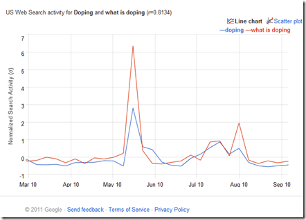
Now, let’s try something a bit more relevant to sport. Let’s try “doping”, as you can see, there are peaks of searches and the highest correlation coefficient is with “what is doping”.
with peaks in May 2010….when Landis admitted taking performance enhancing drugs and pointed the finger at Lance Armstrong.
 The word “Testosterone” has the highest correlation coefficient with “Natural Levels”. And there seems to be a growing interest in such search word, I hope only because people are interested in the science….
The search for “Strength training” really worried me. A part from the highest correlation coefficient with “Exercise” what worries me is the decline in its use for web search. Does it mean we should expected a reduction of interest towards this form of exercise?
So, to double check I looked at the search word “Bodybuilding”…and I got really worried as the highest correlation was with “death index”….whatever that means
Really an interesting tool. You can look at it yourself on: http://correlate.googlelabs.com/.
Another tool is Google Trends. Even cooler, as it allows you to study search volumes and look at specific media-related events. Again, when searching for volumes of searches of the keyword “Doping” specific events where highlighted.
Brilliant stuff from Google Labs. Keep them coming!


You must be logged in to post a comment.